
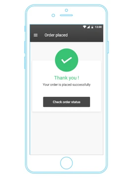
" The idea behind this app was to make doing laundry as effortless as ordering a pizza, just a few taps, and voilà! Your laundry is taken care of "
But here's the twist: while people have eagerly embraced ordering food online, many still cling to the old-school charm of their neighborhood laundromats. Our mission was to create a laundry app so intuitive and unique that it would lure even the most die-hard fans of offline laundry services to join the digital revolution. Think of it as the ‘Uber’ of laundry, but with fewer spills and more thrills
Step 1 : Understanding the Product
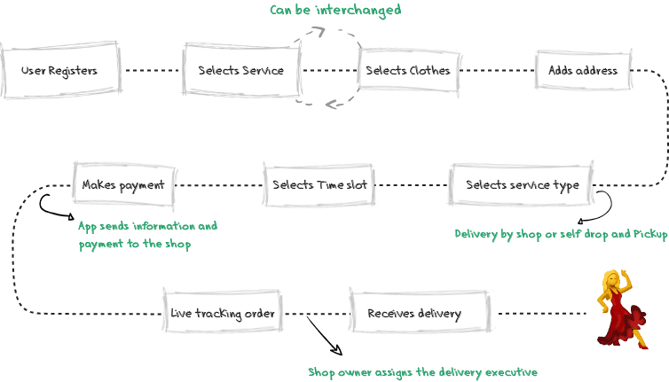
First, I jotted down all the requirements to get a clear picture of the product goals and sketched a rough user flow with the features in mind. The aim was to save users from the tedious laundry process and make their lives a whole lot easier.
Think of Laundry Kare as the ultimate matchmaker, but for laundry! It seamlessly connects the customer, the shop owner, and the delivery executive, passing information back and forth like a digital cupid. No more laundry day blues—just smooth, effortless service!
Step 2 - Competitors research
With the basic flow mapped out, I dove into researching our competitors. The goal was to understand their structures and find areas for improvement. After a week of exploring, I stumbled upon a major issue: navigating through their apps was like going through a maze just to select services and clothes.
I often lost track of what I had added. It seemed like everyone was following the same confusing blueprint. My first mission? Ditch the endless sub-sections and bring everything onto one screen—without creating a chaotic laundry list!
Step 3 - User Insight
To dig deeper and understand real user issues, I chatted with a bunch of people (mostly friends and family) who fit our target audience profile.
Here are some of the clear pain points I discovered:
I'm not aware of the shops around me as I am new here. that's why I stick to the one that my PG owner suggested.
It's quite difficult to find the shops online and if I do too, then it's a headache going to different shops personally or contacting them individually to compare the prices. So I end up going to the nearest one
I prefer the same shop even though their rates are high because I have had some bad experience with few shops in past. Now I don't wanna risk getting the clothes spoiled
I Look for many other things in a shop like, area, price or quality of service.
Limited information about different shops and their prices
Users didn't want to spend a lot of time researching
Trusting a new shop was difficult
Price wasn't the only concern
It was like they were saying, 'Help! I just want my laundry done without turning into Sherlock Holmes!
Step 4 - Ideation
Armed with insights from my competitor research and user interviews, it was time to revamp the user flow and add some valuable features:
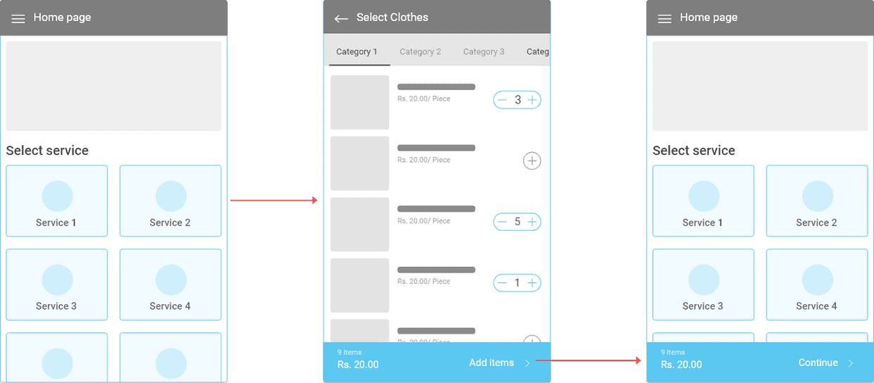
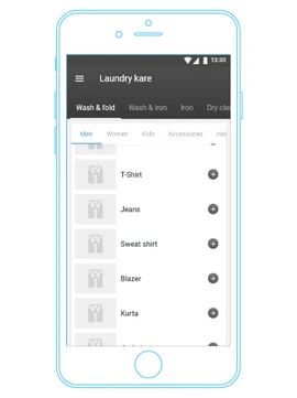
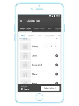
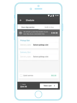
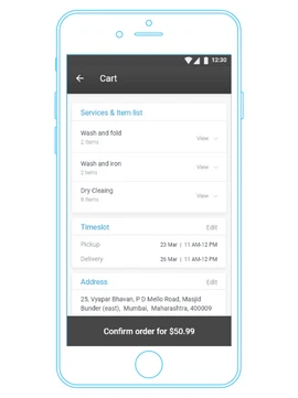
- Merged services and item selections into a single page—no more endless clicking!
- Removed pricing from the selection page to keep things simple.
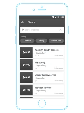
- Introduced a shop selection page, listing shops offering the services.
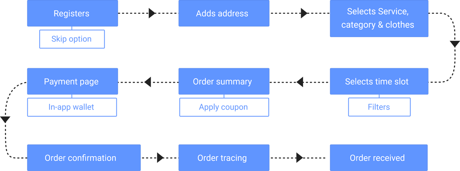
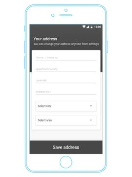
- Moved address input to immediately after sign-up, so users don't have to select it every time (they can still change it whenever they want).
Think of it as giving the app a much-needed makeover, turning it from a cluttered closet into a sleek, organized wardrobe!
Step 5 - Wireframing
With plenty of data in hand, I dove into creating a high-fidelity wireframe and prototype for the app. This step was crucial to spot any technical issues before moving into full development. We had several lively discussions with the business team and developers, who provided valuable feedback. Based on their insights, I made some adjustments to the home and shop selection modules, adding and removing elements as needed. Despite these changes, the core information architecture of the app remained solid and unchanged.
It felt like constructing a robust laundry fortress—solid, efficient, and ready to tackle any dirty laundry that came its way while keeping the user experience smooth and straightforward
Step 6 - Interface Designs
With the UX sailing smoothly and a thumbs-up from the product leads, I dove headfirst into crafting the interface of the app.
Here's where the magic happened—I sprinkled in some fresh insights to take the design up a notch:
- Embracing the light side of theming to give the app a crisp, spick-and-span look.
- Dividing sections with cards, because let's face it, nobody wants their laundry and dry cleaning options all mixed up like mismatched socks!
- Making the Call-to-Actions (CTAs) as informative as a chatty laundromat attendant, guiding users seamlessly to their next steps.
- Painting the town blue, but not too blue—only the selected items and action buttons got to join the cool kids' club. After all, we want users to feel like they're making the right choices, not drowning in a sea of options!
It was like giving the app a fresh coat of paint, making it as inviting and easy to navigate as a freshly fluffed pile of laundry!
Framer 2024
Hyderabad